
Chicago Bears Collector Edition Pen
$41.55
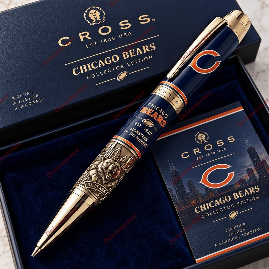
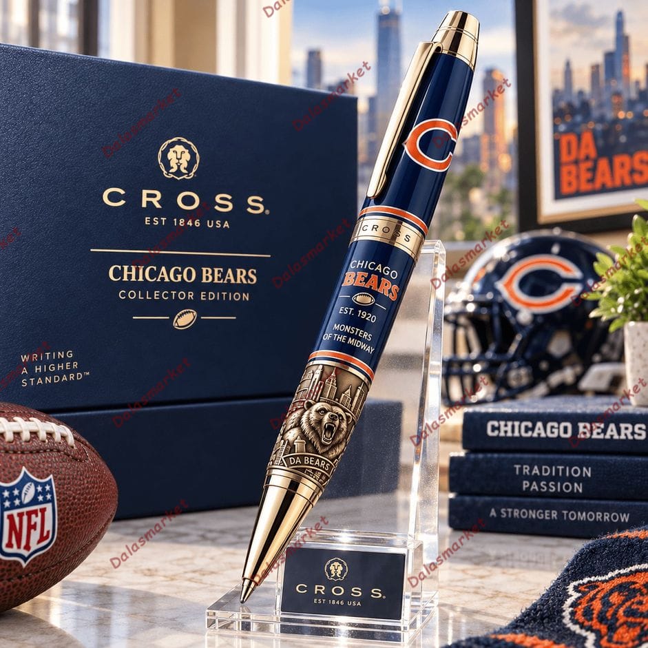
The Chicago Bears Collector Edition Pen combines the Bears’ classic navy-and-orange identity with gold-tone accents and detailed Chicago-inspired artwork. Featuring the iconic “C” emblem, Monsters of the Midway wording, a dramatic bear motif and Da Bears detail, it turns an everyday writing piece into something much more display-worthy.
-
5% OFF 2 items get 5% OFF on cart total
-
10% OFF 3 items get 10% OFF on cart total
-
15% OFF 4 items get 15% OFF on cart total
I Saw the “C” First. The Bear at the Bottom Changed the Whole Pen.
At first glance, this one feels surprisingly clean.
Dark navy barrel. Orange accents. Gold-tone trim. A large C near the top.
Then my eyes moved toward the writing tip.
That’s where the Chicago Bears Collector Edition Pen gets much more interesting.
The smooth navy section suddenly gives way to intricate antique-gold-style artwork: Chicago architecture rises behind a roaring bear, while a small DA BEARS banner sits underneath.
It almost feels like two designs sharing the same pen—the upper half represents the team, while the lower half represents the attitude surrounding it.
“Monsters of the Midway” Is the Detail That Belongs Here
Across the center of the pictured barrel are:
CHICAGO BEARS
EST. 1920
MONSTERS OF THE MIDWAY
That 1920 date reaches back to the franchise’s beginning as the Decatur Staleys. The team moved to Chicago in 1921 and adopted the Chicago Bears name in 1922.
And “Monsters of the Midway” isn’t simply decorative wording created for the pen. It remains part of Bears culture today—the organization continues to use the identity in official projects, including its Monsters of the Midway series.
That history gives the middle of the pen a little more meaning without requiring the design to turn into a timeline.
Navy and Orange Keep It Recognizably Chicago
There are a lot of gold-tone details here, but I like that they don’t overwhelm the Bears colors.
The barrel remains predominantly deep navy, interrupted by narrow orange-and-white bands. The familiar orange C sits prominently near the cap, while BEARS gets another orange treatment farther down.
Then gold-tone hardware takes over at the clip, center rings and writing tip.
The combination feels more polished than simply covering an ordinary pen in team logos.
Even the color choice has history behind it: the Bears say founder George Halas brought navy and orange from his University of Illinois background into the team’s identity.
The Box Is Quiet. The Pen Isn’t.
That’s probably the right decision.
The pictured collector-style box is almost entirely navy with restrained gold lettering:
CHICAGO BEARS
COLLECTOR EDITION
Inside, a deep blue lining provides the background for the much more detailed pen.
A coordinating card carries the Bears “C,” Chicago skyline imagery and the words:
TRADITION
PASSION
A STRONGER TOMORROW
I wouldn’t put this pen into an ordinary desk cup.
I’d leave the presentation open on a shelf or desk, use the pen when I wanted it, and put it back afterward. The packaging is too coordinated with the design to immediately throw aside.
Product Details
Product: Chicago Bears Collector Edition Pen
Design Colors: Navy, orange and gold-tone accents
Visible Team Details: Chicago Bears wording and “C” emblem
Artwork: Roaring bear, Chicago-inspired architecture and football details
Visible Wording: EST. 1920, Monsters of the Midway and Da Bears
Presentation: Pictured with a coordinating collector-style box and themed card
Use: Writing and decorative display
FAQ
What makes the lower section different?
The lower barrel uses much more intricate artwork, combining a roaring bear with Chicago-inspired architectural details and a Da Bears banner.
What does “EST. 1920” mean?
It refers to the franchise’s origins in 1920 as the Decatur Staleys. The club later moved to Chicago and became the Chicago Bears.
Is “Monsters of the Midway” connected with the Bears?
Yes. The phrase has a long association with the Chicago Bears and remains part of the team’s branding and fan culture today.
If I had to pick one section to show in the product gallery close-up, it wouldn’t be the big C. I’d zoom straight in on that roaring bear surrounded by the Chicago skyline. That’s where this stops looking like a regular logo pen and starts feeling like a piece designed specifically around Bears culture.
Be the first to review “Chicago Bears Collector Edition Pen”
Related products
FAN MERCH & ACCESSORIES
FAN MERCH & ACCESSORIES
FAN MERCH & ACCESSORIES
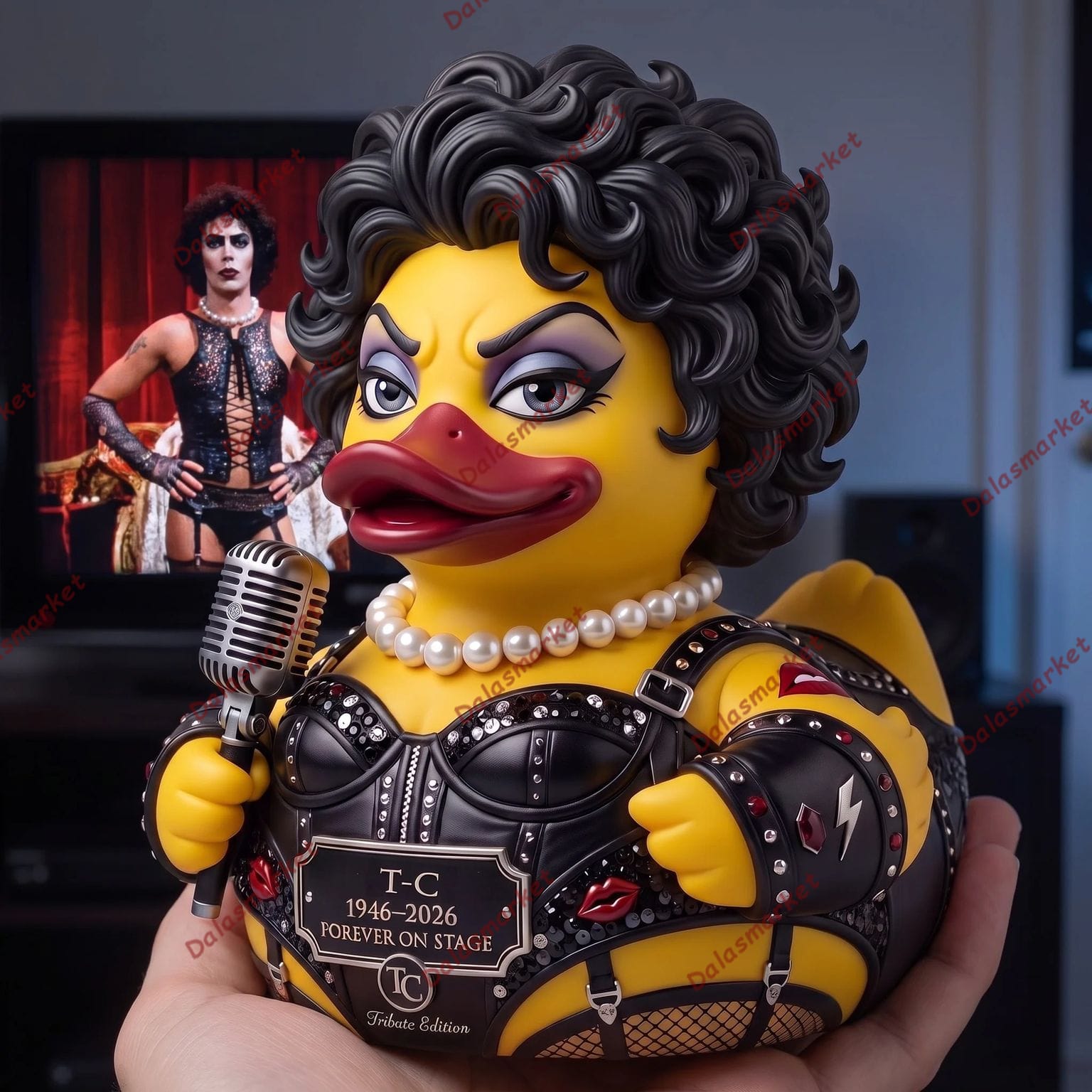
TC Dr. Frank-N-Furter 1946–2026 Memorial Tribute Rubber Duck
FAN MERCH & ACCESSORIES
FAN MERCH & ACCESSORIES
FAN MERCH & ACCESSORIES


FAN MERCH & ACCESSORIES

FAN MERCH & ACCESSORIES
Reviews
There are no reviews yet.