
Alpha Kappa Alpha Collector Edition Pen
$41.55
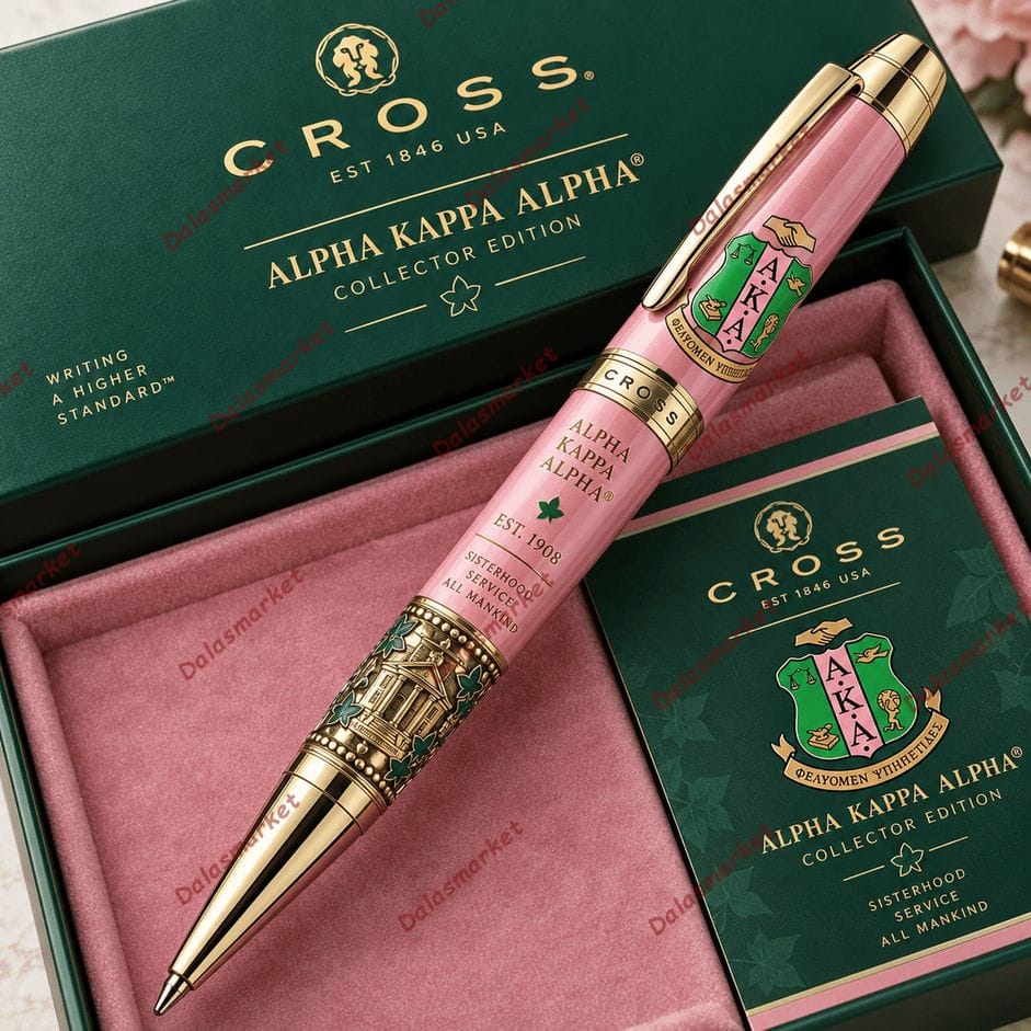
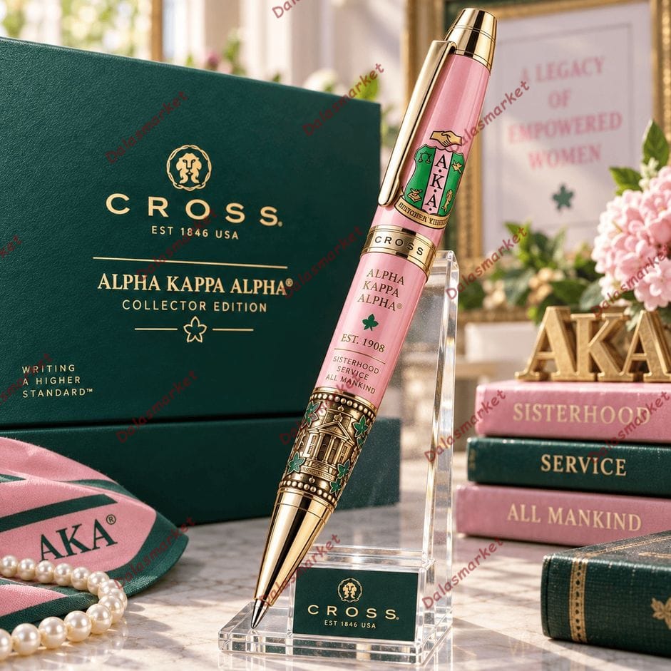
The Alpha Kappa Alpha Collector Edition Pen brings together the signature pink-and-green color palette, crest-inspired artwork, ivy details and “Sisterhood, Service to All Mankind” wording in an elegant collector-style writing piece. Gold-tone accents and detailed architectural artwork give the design a polished presentation from cap to tip.
-
5% OFF 2 items get 5% OFF on cart total
-
10% OFF 3 items get 10% OFF on cart total
-
15% OFF 4 items get 15% OFF on cart total
Alpha Kappa Alpha Collector Edition Pen – The Pink Catches Your Eye. The Details Make You Turn the Pen Around.
This one doesn’t need a complicated introduction.
Pink barrel. Deep green presentation box. Gold-tone accents.
You already know the color story before you’ve looked closely at anything else.
But the Alpha Kappa Alpha Collector Edition Pen becomes much more interesting once you start moving down the barrel.
Near the top is the familiar shield-style AKA imagery. The center carries ALPHA KAPPA ALPHA, EST. 1908, and a small green ivy-inspired symbol.
Then, underneath:
SISTERHOOD
SERVICE TO
ALL MANKIND
It gives the design a sense of identity beyond simply using pink and green.
The Lower Section Is Almost a Miniature Tribute Scene
This is the part I’d want photographed separately for the product gallery.
As the pink barrel ends, the design shifts into an antique gold-tone section filled with much finer detailing.
A stately building appears at the center, surrounded by green ivy-style leaves, ornamental borders and raised-looking decorative elements.
That change in texture and visual density is important.
If the entire pen were pink with logos repeated from top to bottom, it could easily feel like ordinary branded stationery. Instead, the lower artwork gives it the appearance of a commemorative piece.
The polished gold-tone writing tip finishes that transition nicely.
Pink, Green and Gold Work Differently Across the Design
What I like here is that the three main colors aren’t competing equally for attention.
Pink owns the barrel.
Green frames the presentation and appears in smaller symbolic details.
Gold-tone accents connect everything together through the clip, center bands, decorative lower barrel and tip.
Even the pictured collector box follows that hierarchy: deep green outside, soft pink inside, and gold-tone lettering across the lid.
It looks coordinated without simply making every component identical.
I’d Keep the Box Open on the Desk
The presentation is too much a part of the design to hide away.
The pictured dark green box carries Alpha Kappa Alpha Collector Edition lettering, while its pink interior creates a matching background for the pen.
A coordinating card repeats the green-and-pink palette with crest-inspired artwork and the same sisterhood-and-service theme.
Placed together, the set feels suitable for a desk, bookshelf or keepsake display.
And that’s probably how I’d use it: write with the pen when needed, then put it back rather than letting it disappear into a drawer with ordinary office supplies.
Product Details
Product: Alpha Kappa Alpha Collector Edition Pen
Color Palette: Pink, green and gold-tone accents
Visible Artwork: AKA crest-inspired design, ivy motifs and architectural imagery
Visible Date: EST. 1908
Visible Wording: Alpha Kappa Alpha and “Sisterhood, Service to All Mankind”
Presentation: Pictured with coordinating green collector-style box, pink interior and themed card
Use: Functional writing piece and decorative collectible display
FAQ
What colors are featured on the pen?
The pictured design primarily combines pink with green details and polished gold-tone accents.
What details appear on the lower barrel?
The lower section features intricate architectural imagery surrounded by ivy-inspired leaves and ornamental gold-tone detailing.
Does the pen include Alpha Kappa Alpha-inspired details beyond the colors?
Yes. The pictured design includes crest-inspired artwork, Alpha Kappa Alpha lettering, EST. 1908, ivy imagery and “Sisterhood, Service to All Mankind” wording.
Is it suitable for display?
Yes. The coordinated presentation shown with the pen makes it well suited to a desk, shelf or keepsake collection when not being used for writing.
The big crest-inspired artwork tells the story immediately, but I’d zoom in on the lower gold section for the second product photo. The tiny building, ivy leaves and ornamental detailing are the kind of things someone might completely miss until they see the pen up close.
Be the first to review “Alpha Kappa Alpha Collector Edition Pen”
Related products


FAN MERCH & ACCESSORIES


FAN MERCH & ACCESSORIES

FAN MERCH & ACCESSORIES


FAN MERCH & ACCESSORIES


FAN MERCH & ACCESSORIES
FAN MERCH & ACCESSORIES


FAN MERCH & ACCESSORIES
FAN MERCH & ACCESSORIES
Reviews
There are no reviews yet.